Veyra, Beauty booking with no hidden fees
A two-sided booking app for beauty freelancers and their clients, where every fee and deposit is shown before anyone pays.
- What I did
- End-to-end product design from research through flows, UI, prototyping, and a mini design system.
- Year
- 2025
- Role
- Founding Product Designer
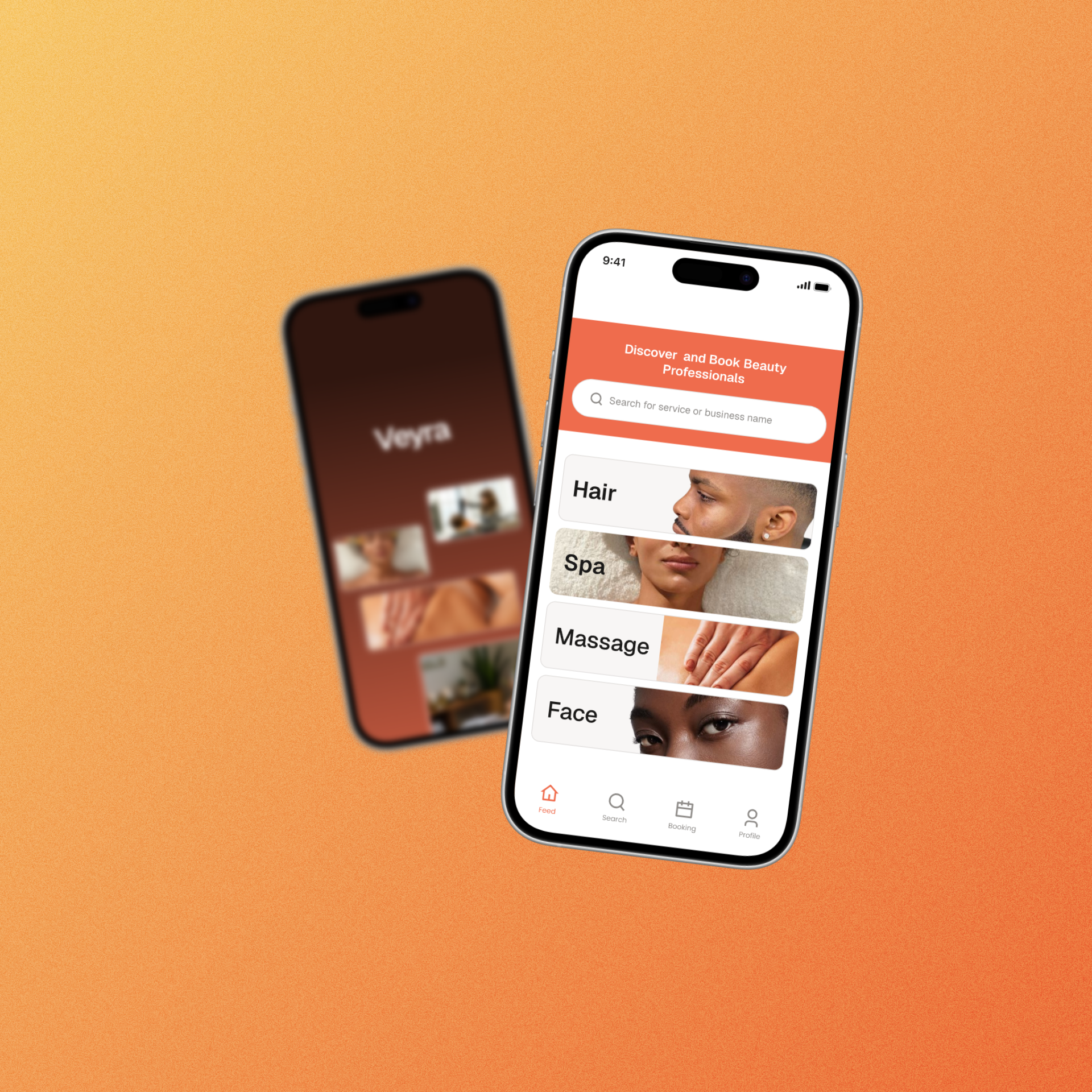
- Timeline
- 4 months, 2025
- Platforms
- iOS and Android
- Status
- Fully built, not yet on the App Store
Tools
Scope

- 25
- interviews (15 vendors, 10 customers)
- 18 of 20
- booking tasks completed in usability testing
- 10%
- platform fee, shown on every payout
- 65+
- screens across iOS and Android
Overview
Beauty freelancers find most of their clients through Instagram, TikTok and word of mouth. The booking platforms that could help them grow charge high fees and hide them. I designed Veyra end to end, from research to a mini design system. It has a customer app for finding and booking local professionals, and a vendor app for running the business day to day.
The problem
Vendors
Skilled nail techs, barbers, braiders and makeup artists grow slowly because their reach stops at their followers. The platforms that could widen it charge high commissions, hide them, and bury vendors in complicated dashboards.
“I don’t have time for complicated dashboards. If it’s not simple, I won’t use it.”
Salon owner, research interview
Customers
Finding someone good nearby means scrolling social media, asking friends, and messaging to check availability that’s often out of date.
Research
I interviewed 15 vendors and 10 customers, did a competitive UX teardown of existing booking apps, and mapped how people find beauty professionals today. Four findings shaped the product:
- High and hidden fees break trust. Vendors complained that competing platforms charge high fees they can’t see clearly.
- Complexity kills adoption. Customers wanted a simple booking process. Vendors rejected complicated dashboards.
- Discovery is scattered. 12 of 15 vendors already showcase their work on Instagram and TikTok, but customers can’t search across them in one place.
- Trust and location decide the booking. Customers want proof of real work and someone nearby, and competitors’ availability was often out of date.
Decision 1: Put the fee on the screen
Competitors hid their fees, so I made ours impossible to miss. Every payout on the vendor dashboard shows the 10% platform fee as its own line, next to what was earned and what’s still pending. Vendors see exactly what Veyra takes before they wonder about it.

- Bookings
- €1,400
- Platform fee (10%)
- −€140
- Total earned
- €1,260
- Paid out
- €1,000
- Pending
- €260
Decision 2: Import the portfolio vendors already have
The plan
Our first plan was a native portfolio builder. Vendors would upload their work into Veyra photo by photo and build a portfolio from scratch.
What research showed
12 of the 15 vendors we interviewed already kept their work on Instagram and TikTok. Asking them to rebuild it one image at a time meant asking busy people to repeat work they had already done, before Veyra had sent them a single client.
What we changed
We moved away from the builder as the main path. Vendors now import their existing work straight from Instagram and TikTok. Manual upload is still available, but it’s no longer the default. The same thinking shaped the invite link at the top of the vendor dashboard: vendors can bring their existing clients in, instead of waiting to be discovered.
Before & after
Before: native “Build your portfolio” upload screen. After: Instagram and TikTok import flow. Add cropped before/after images to the slider when ready; Key features.png above also shows both portfolio paths in the deck collage.
Decision 3: A deposit that protects vendors
No-shows cost vendors a booked slot. Customers pay a 10% deposit at booking, €5 on a €50 service. The deposit counts towards the total and is shown on the review screen before payment, so the customer knows what they’re paying and the vendor knows the booking is real.

- Service
- Haircut and Beard Trim
- Total service cost
- €50.00
- Pay at salon
- €45.00
- Deposit (due now)
- €5.00
Decision 4: Direct contact to fix unreliable availability
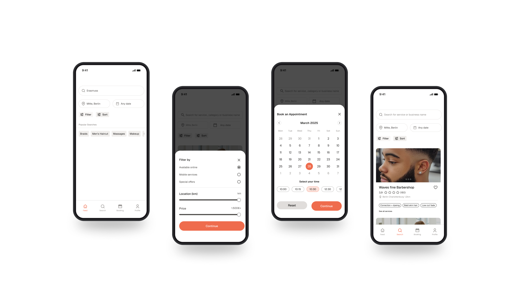
Customers complained that competitors showed outdated availability and gave no way to reach the vendor. Vendor profiles on Veyra include a Call button and the vendor’s social links, so customers can confirm a slot and see real work before booking.

Decision 5: Vendors chose the dashboard
I tested two dashboard directions with vendors. Exploration 1 led with today’s earnings and a full schedule. Exploration 2 led with an invite link and the next appointment, with earnings lower down. 4 of 5 vendors chose Exploration 2.

- Next appointment
- Olayemi Odeyemi, Fade + Beard Trim, 2:30 PM, €50
- Today
- 3 appointments, €320 expected
- 10:00
- Maria Olaitan — Box braids — €150
- 12:00
- Aisha Kahn — Gel manicure — €120
- 14:30
- Olayemi Odeyemi — Fade + Beard Trim — €50
Design system
A mini design system of 45+ components, a 4px spacing system, and colour and type scales. It kept 65+ screens consistent across iOS and Android, and gave the developer one source of truth.

Results
Veyra is fully built but not yet on the App Store, so these are validation results, not live data.
- 18 of 20 booking tasks completed across 5 usability sessions, from search to confirmation.
- 4 of 5 vendors chose the final dashboard direction.
- Vendors in concept testing said they were very likely to adopt Veyra, and named the simple dashboard and visible fees as the reasons.
- Testers described the design as “clean”, “simple” and “more trustworthy” than competitors.
After launch, I’d track search-to-booking conversion, no-show rate with the deposit in place, and vendor retention after the first month.
Reflection: The business model is UX
I went in thinking the design challenge was the booking flow. The research showed the fee was a design problem too: vendors trusted a platform when they could see what it charged. The biggest change in the project came from noticing what vendors already had. They had portfolios on Instagram and TikTok and clients from word of mouth, and the best features met them there instead of asking them to start again.