Redesigning the S&S Website for Better Booking & Discovery
20 Nov 2021
I led the strategic redesign of a multi-location website, focusing on enhancing user flows, clear information discovery, and modernizing its content architecture.
This is a collection of key works I designed and collaborated on at S&S. As the product designer and owner, I tackled multiple projects under a unified brand, focusing on improving conversion, scalability, and usability across fragmented conference platforms. My work involved conducting usability audits, rethinking end-to-end user journeys, and establishing a modern design system. I collaborated closely with developers and stakeholders, consistently aligning user needs with business goals.
Tools
Scope
Team
Design Process
My design process was non-linear and adaptive, shaped by the realities of managing multiple projects under a unified brand. I began by identifying UX flaws and usability gaps through user interviews, internal feedback, and data insights. In many cases, I aligned early with developers to explore feasibility and tech constraints before stakeholder meetings. As both designer and product owner, I balanced strategic input with hands-on UI decisions, conducting audits, building modular components, prototyping solutions, and iterating based on real usage. Throughout, I prioritized clarity, scalability, and a cohesive user experience.
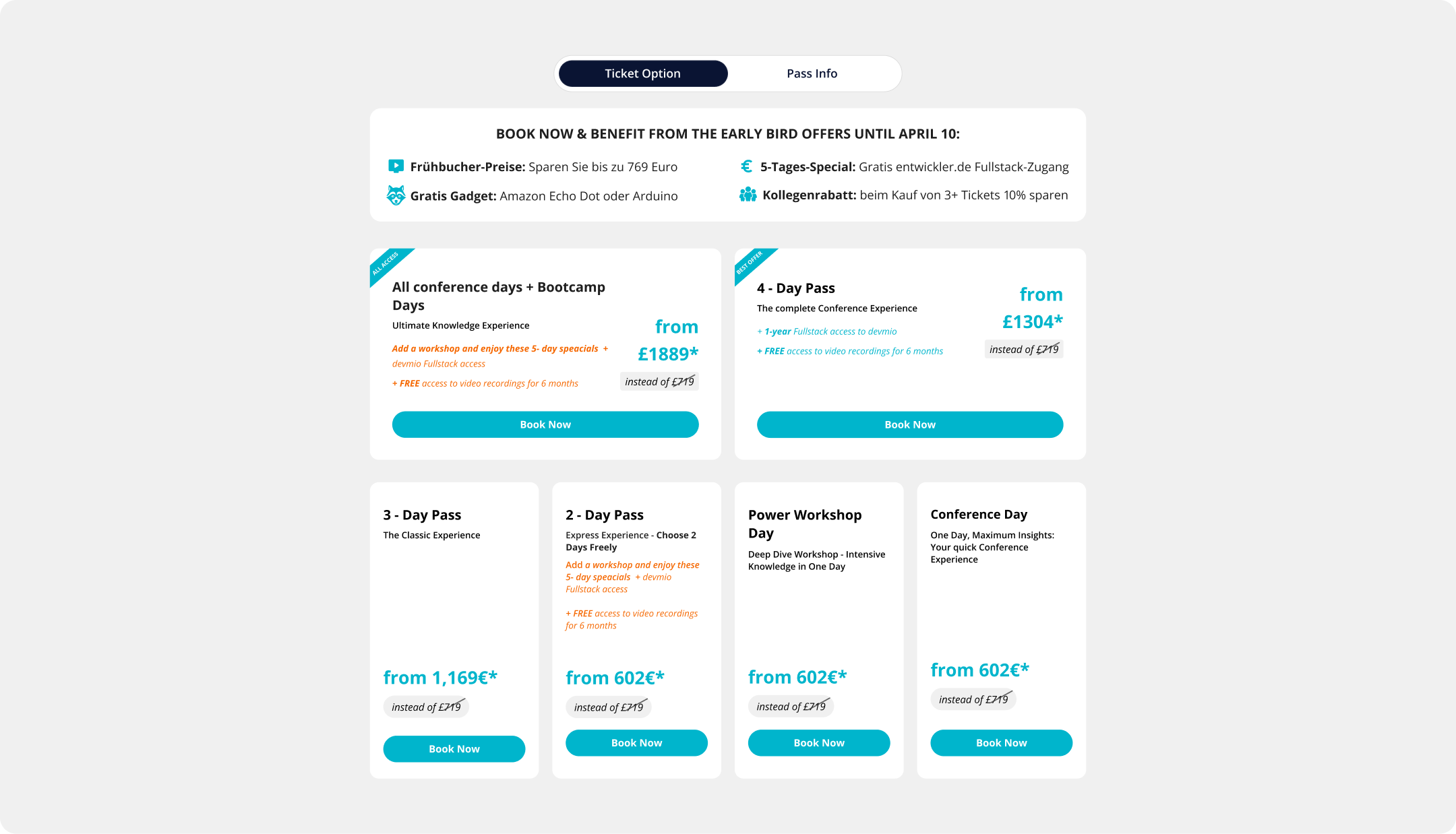
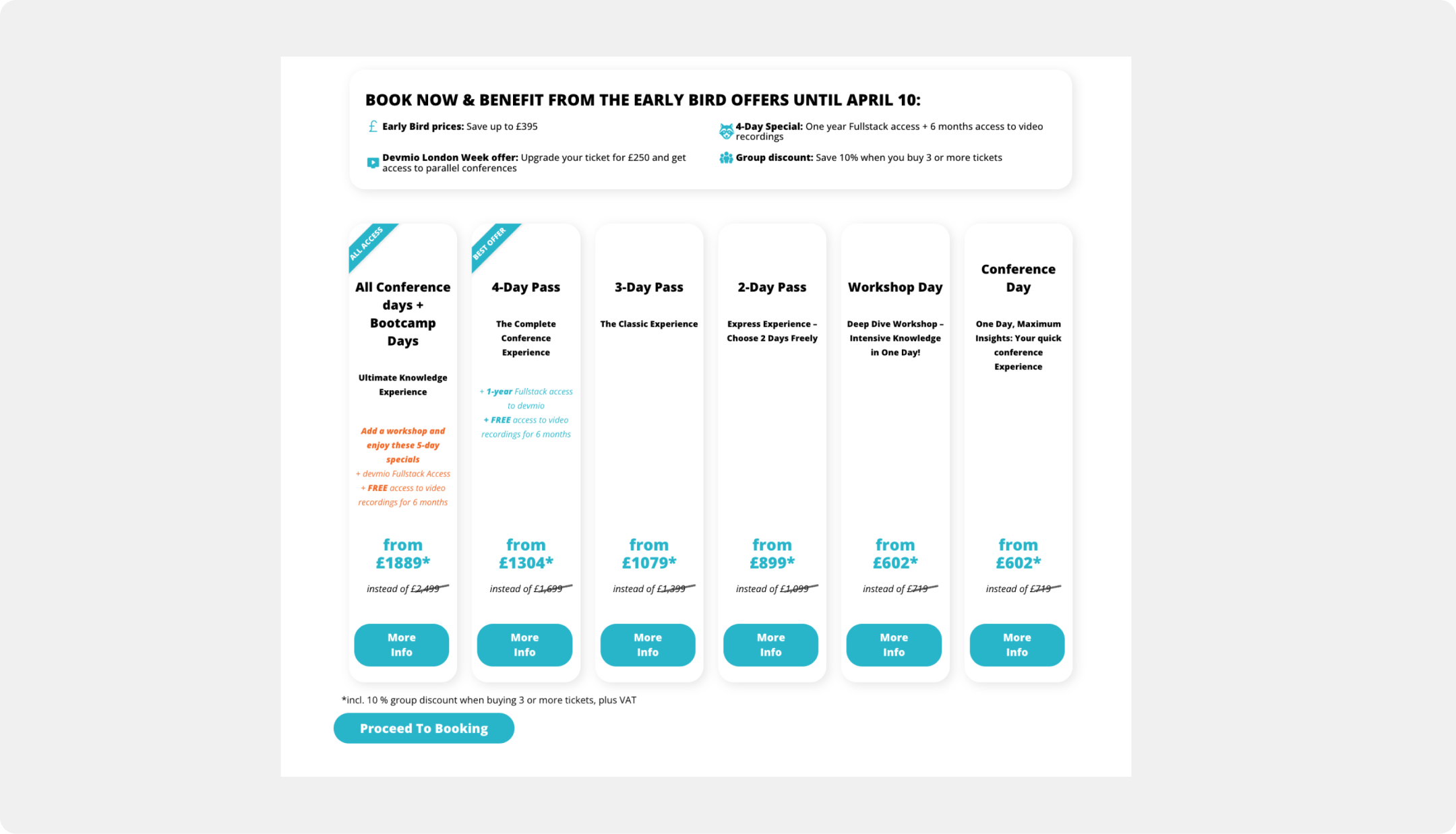
Streamlining Ticket Purchase Flow
Challenge
The purchase path was flawed, causing low conversion. A confusing split-page system for 'Onsite' vs. 'Remote' tickets created a disjointed user journey with unnecessary clicks. The booking flow added friction with generic "More Info" popups that overwhelmed users, while poor visual hierarchy and unclear pricing led to decision paralysis and user drop-off.
The Solution
I unified the 'Onsite' and 'Remote' pages into a single interface with an innovative toggle switch for instant price comparison. To reduce friction, I replaced the repetitive popups with direct 'Book Now' CTAs and organized details into a clean tabbed layout. The final design uses a clear visual hierarchy and enhanced discount highlighting to guide users seamlessly to purchase.
Before & after
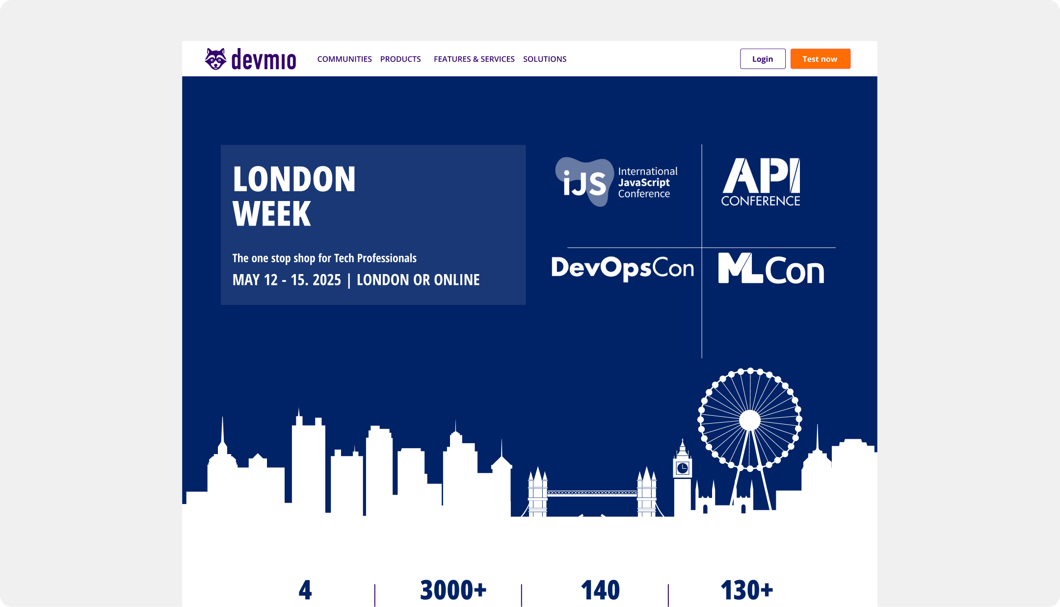
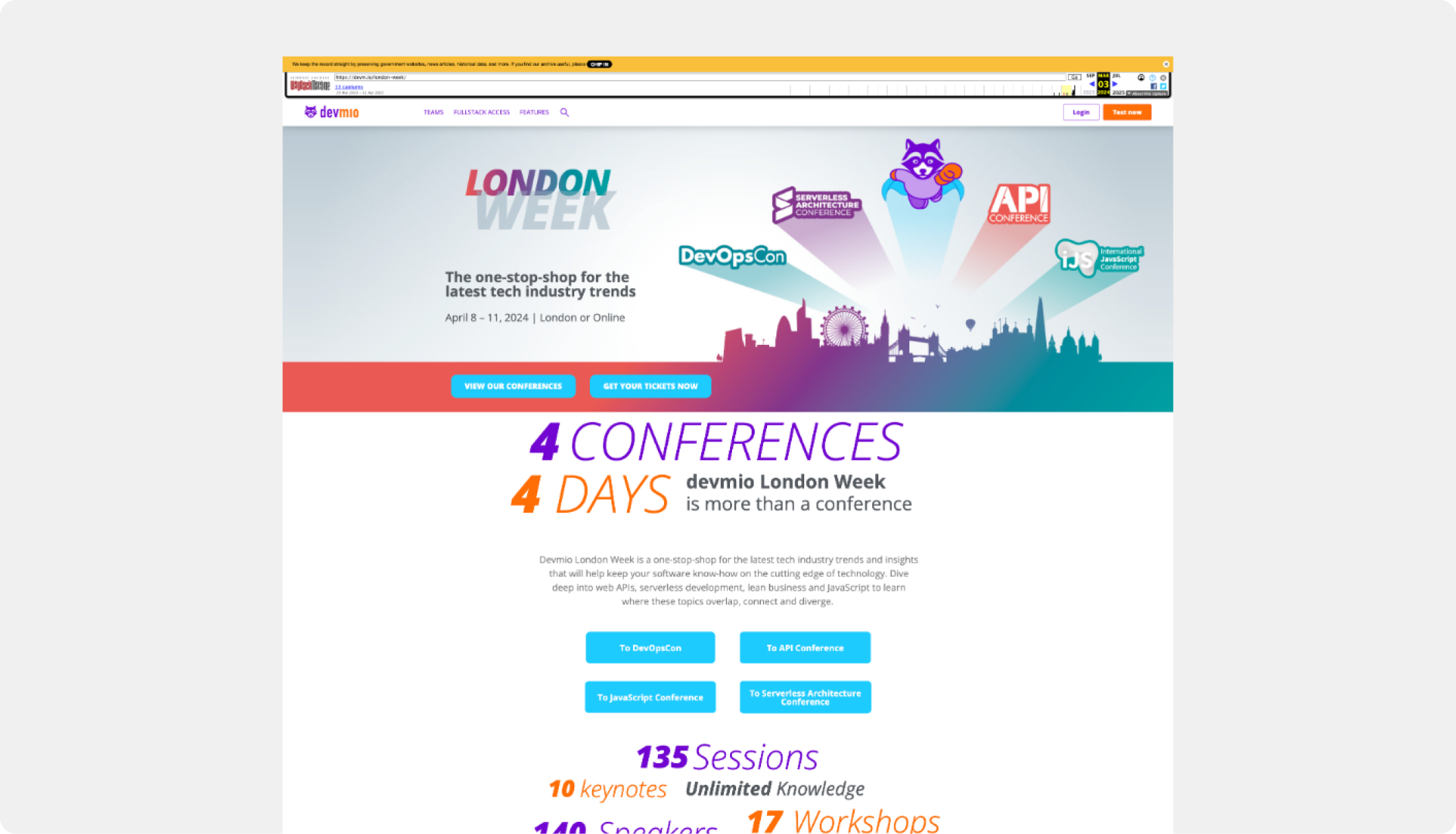
Redesigning Multi-Conference Week Marketing Pages
Challenge
The previous landing page suffered from a fragmented and inconsistent design. A chaotic color palette, competing calls-to-action, and a lack of clear visual hierarchy created a confusing user experience that failed to establish a cohesive brand identity for the event. The cluttered layout and dated visual styles undermined user trust and made it difficult for attendees to understand the value proposition and navigate to a purchase.
The Solution
I introduced a modern, user-centric design that established a clear and professional brand identity for the event. The new page features a strong visual hierarchy, a unified color palette, and clean typography to build user trust. To streamline the user journey, I implemented a consistent design system with a single, clear call-to-action and a well-organized layout that uses generous whitespace to reduce cognitive load and guide users effectively.
Before & after
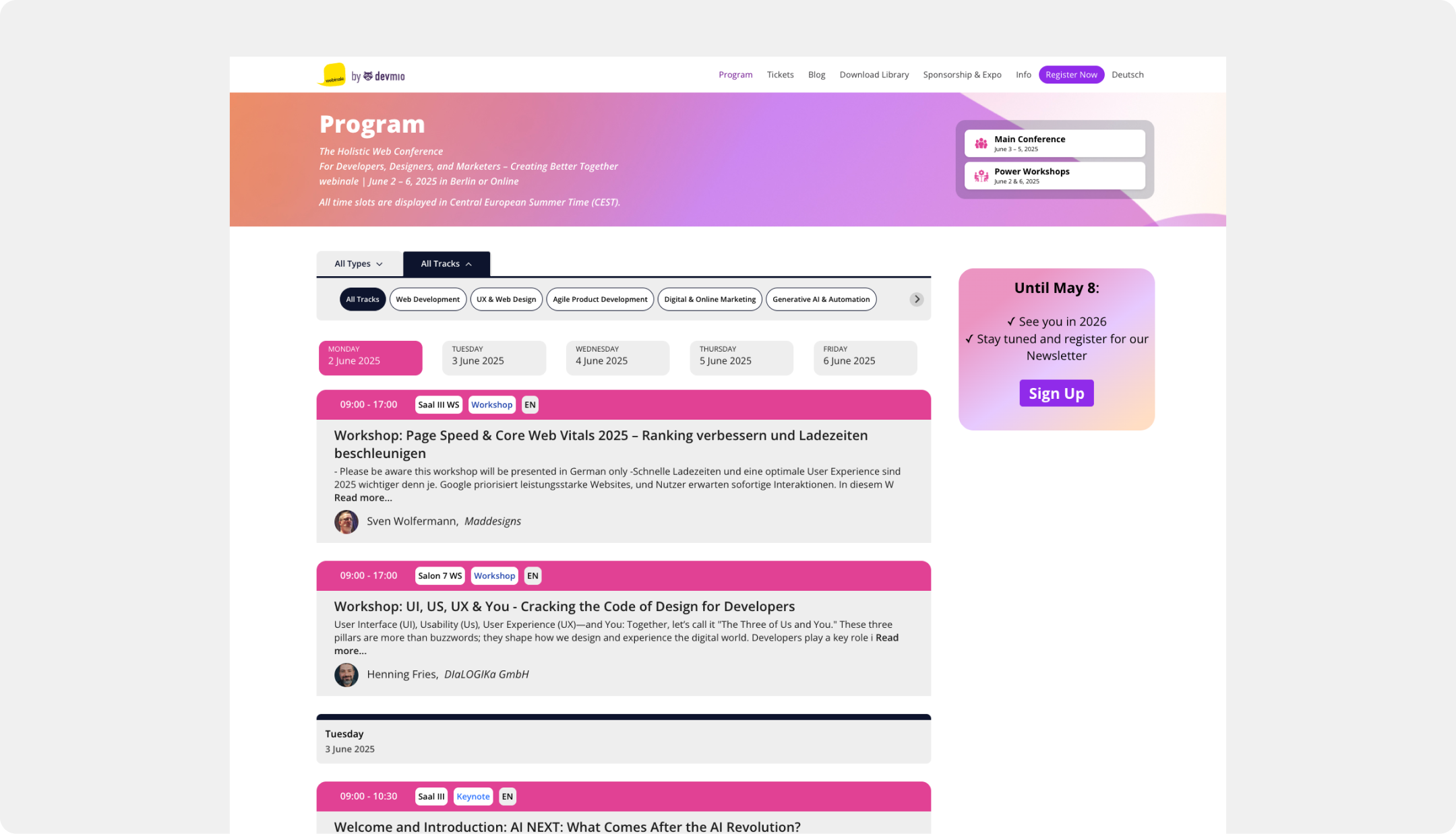
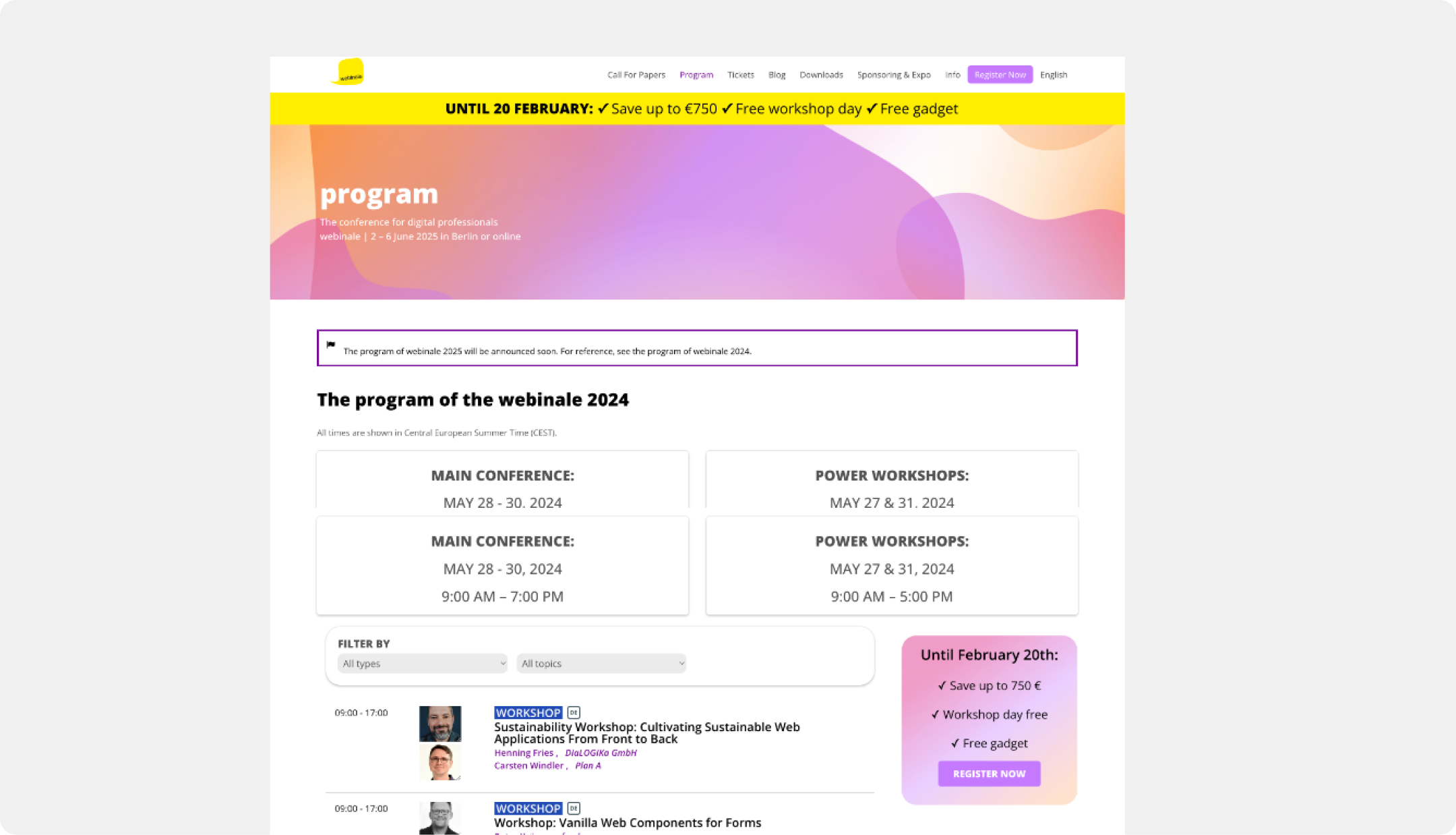
Redesigning the Conference Program Experience
Challenge
The Program Page failed to drive conversions. It was a disconnected experience with inconsistent branding and a poor visual hierarchy that did not guide users toward purchasing a ticket. Lacking clear navigation or engaging content presentation, the page failed to communicate the conference's value, leading to a disjointed user experience and missed revenue.
The Solution
I designed a unified, conversion-optimized interface with prominent branding and clear CTAs. To improve content exploration, I introduced intuitive sub-navigation featuring content filters and an integrated week calendar. Redesigned content cards now prominently display essential session details, all supported by a new, flexible design system.
The Result
- Achieved a 10% increase in user traffic funneled from the Program Page to the ticket page.
- The overall path from content discovery to ticket conversion was significantly improved.
- The Program Page was transformed into an effective marketing and navigation tool.
- A consistent visual experience was established across all platforms (Player, Native App, etc.), building user trust.
Before
Before & after
Transforming the FAQ from an Afterthought to an Asset
Challenge
Customer support was overwhelmed with repetitive inquiries because users couldn't find answers to basic conference logistics on the platform. This lack of a dedicated FAQ or information hub created a confusing experience for attendees and a significant drain on operational resources.
The Solution
I designed and built a comprehensive FAQ information hub from scratch, using clear iconography and structured content to answer common questions. The hub features an intuitive navigation system for efficient self-service. To maximize accessibility, this new resource was strategically placed across key user touchpoints, including the ticket shop and landing pages.
The Result
- This new resource proactively addresses user anxieties and builds attendee confidence.
- Repetitive inquiries to customer support were significantly reduced, easing the burden on the team.
- The overall user experience was improved by providing a reliable, self-service information source.
Creating the "Attend Assist" Conversion Module
Challenge
Many potential attendees needed to justify the conference expense to their managers, creating a barrier to conversion.
The Solution
I designed a simple, powerful content module called "Attend Assist." This feature provides users with a pre-written, customizable approval email they can copy and send to their boss. It's a small but highly effective tool designed to remove a key purchasing obstacle and increase conversions among users who need budget or time-off approval.