A Multi-Brand Design System
05 Apr 2025
Designed to solve the challenge of content discovery on digital platforms, Prism is a multi-brand design system that creates a unified, scalable ecosystem, enabling engaging user experiences across two distinct brands with light and dark themes.
View the system
Featured work

Brief
Create a design system in Figma. The system should include core foundational elements such as a color palette, typography scales, spacing tokens, and a component library.
The design system must support both light and dark themes, allowing for seamless switching.
Multi-brand Architecture: The system must support two imaginary brands. This means the user interface should dynamically reflect each brand's unique corporate identity and style when a brand is selected.
Visual Design: Design 1 small illustration and a set of custom icons to be used in the final UI.
Interaction: Prototype one micro-interaction to showcase animation and user feedback.
Tools
What I worked on
As the product designer, I was responsible for the end-to-end design of The Prism Design System. This included defining the multi-brand architecture, creating core foundational tokens and components, and documenting the system for developer handoff and future collaboration.
The Foundations: A Token-First Approach
- Color palette and semantic tokens
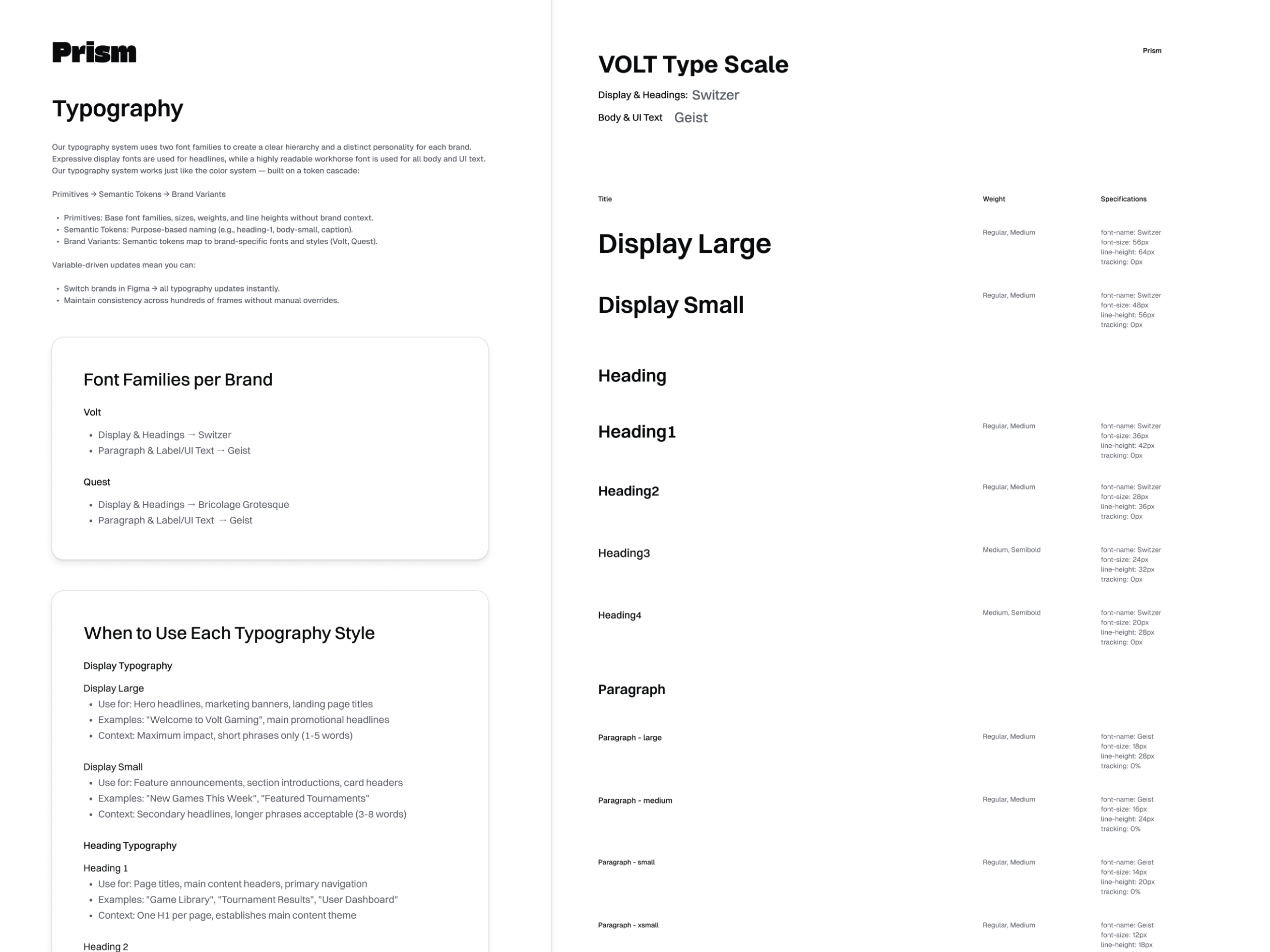
- Typography scales and type hierarchy
- Spacing and layout tokens
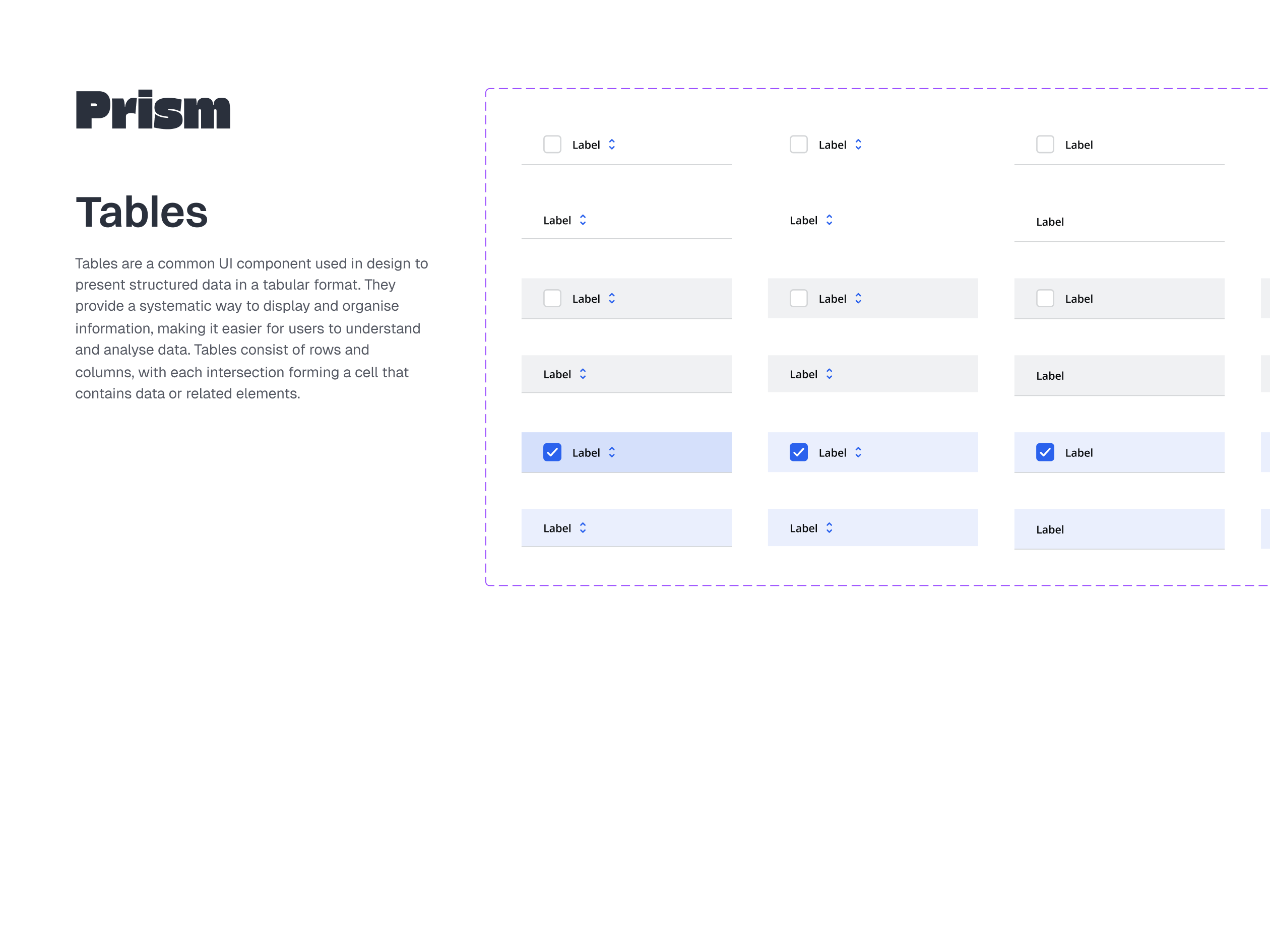
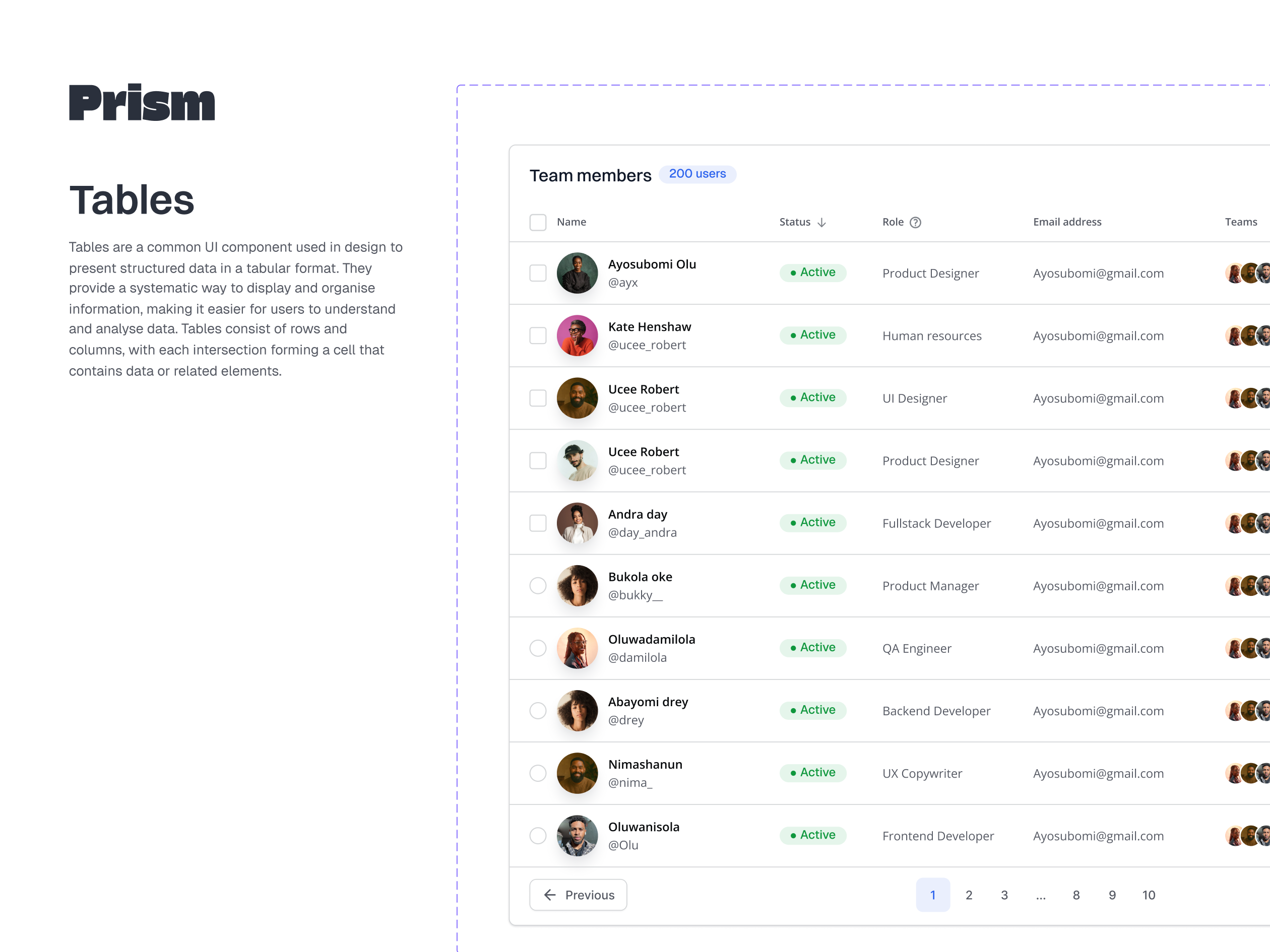
- Component library (atoms to organisms)
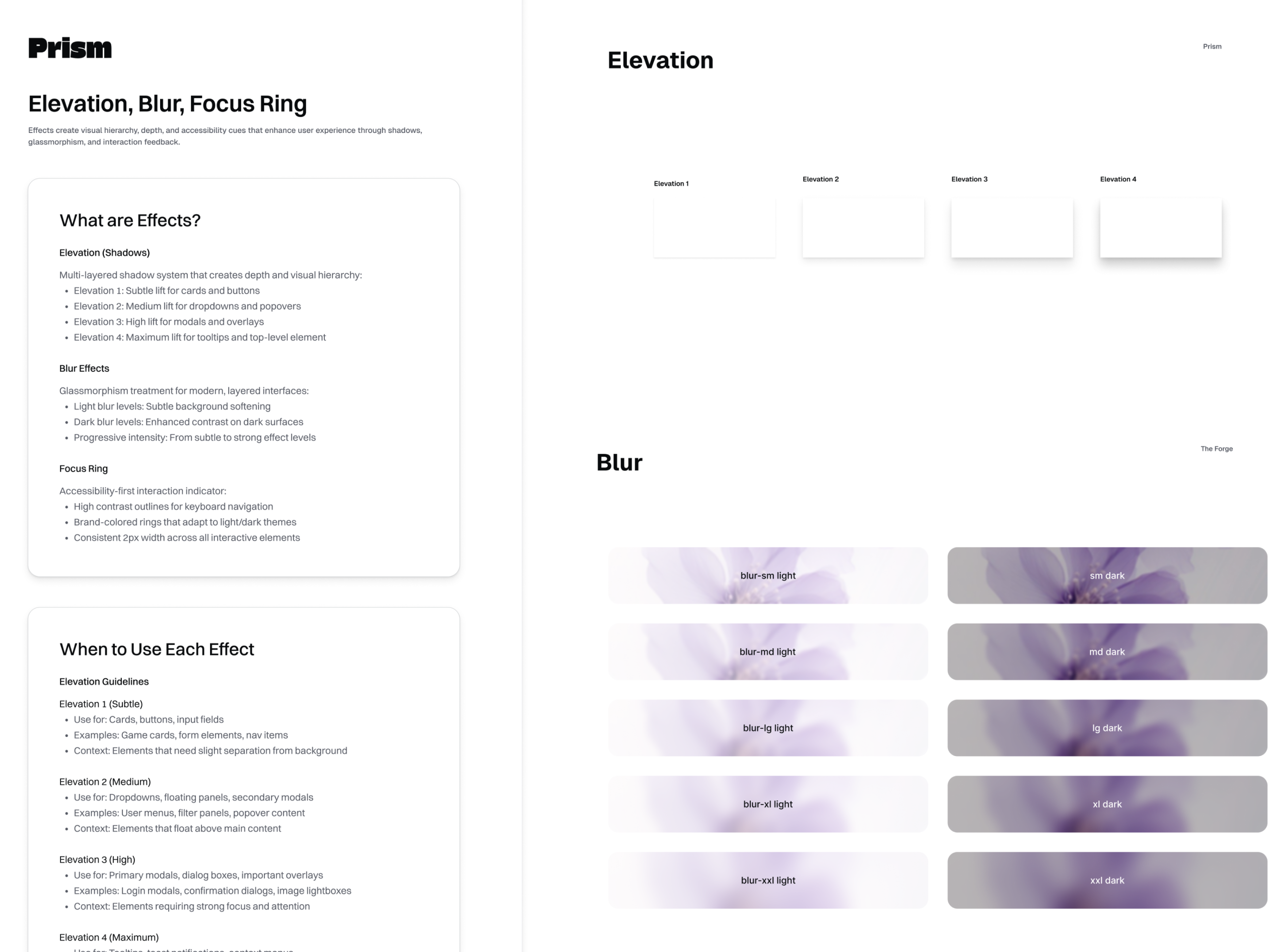
- Light and dark theme support
Token Logic (Naming Taxonomy & Scalability)
- Consistent naming for design tokens across brands
- Scalable token structure for new brands and themes
- Direct mapping from Figma variables to code (CSS variables)
Strategic Foundation: Building a Dynamic Core
To tackle the multi-brand, multi-theme challenge, I designed Prism Design system around a token-first architecture with Figma Variables at its core. This was a critical decision, enabling true dynamism rather than static variations.
Process: I began by mapping out the distinct brand identities of Volt (energetic, confident, blue/orange) and Quest (sophisticated, premium, violet/gold). This informed the creation of our two-tier token system.
Two-Tier Color System
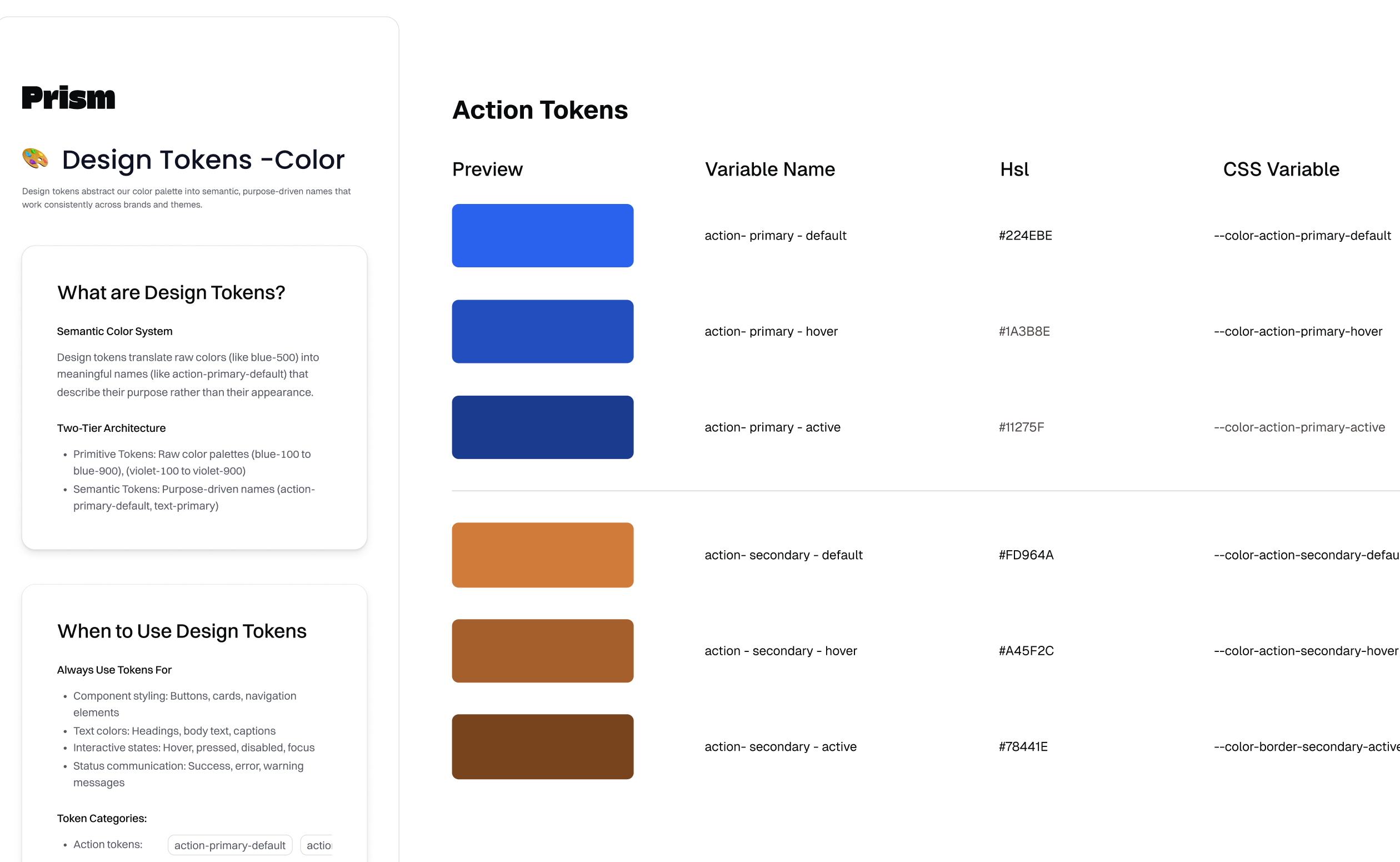
Primitive Tokens: Established a full range of base colors, separating raw values from their usage.
Semantic Tokens: Developed purpose-driven tokens (e.g., surface-background-default, action-primary-default) that dynamically map to brand-specific primitives. This allows components to automatically inherit brand styling.
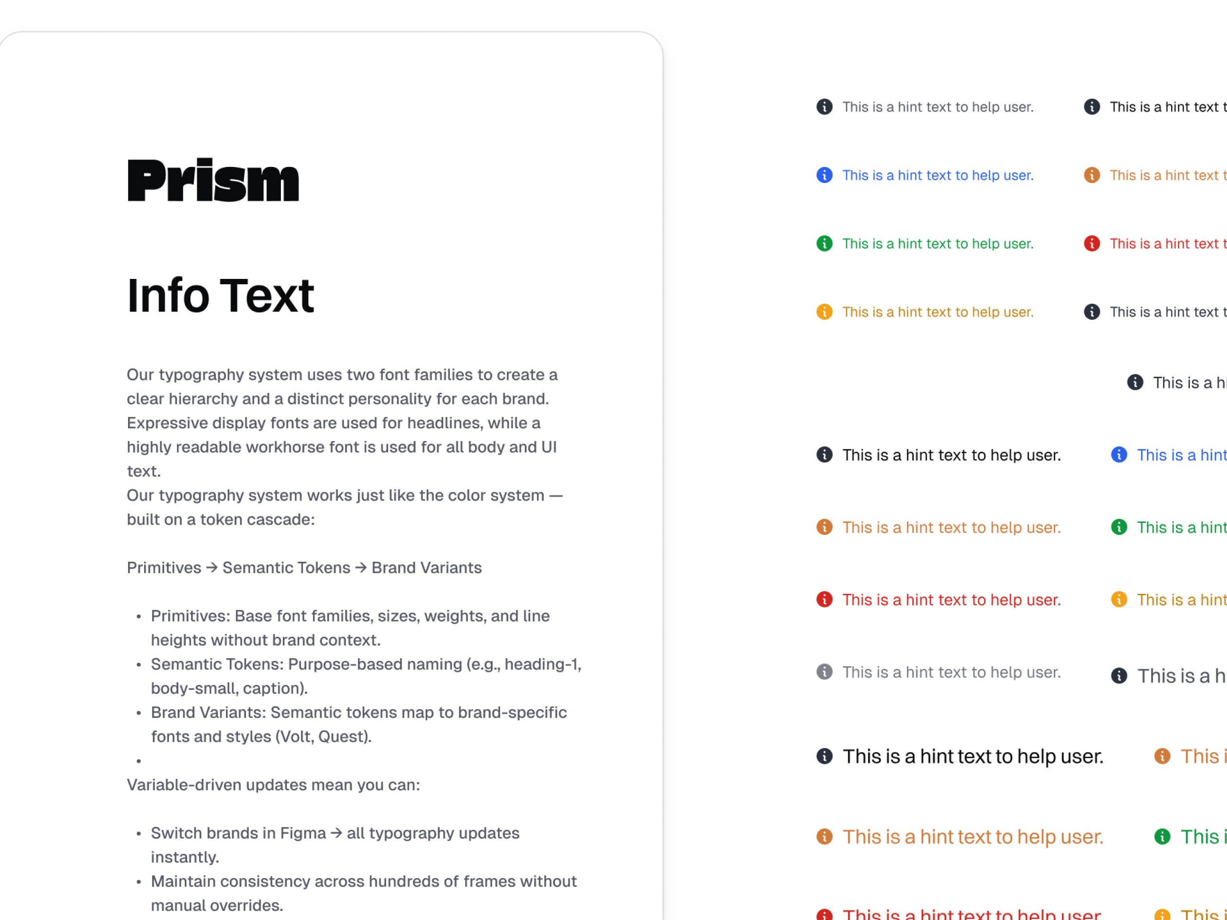
Dynamic Typography: A dual-font strategy was implemented, with distinct display fonts for each brand, unified by a common body font. Figma Variables manage these font swaps effortlessly.
Hybrid Spacing System: A flexible 4px base unit with an 8px rhythm preference was adopted to balance granular control with consistent layout structures.
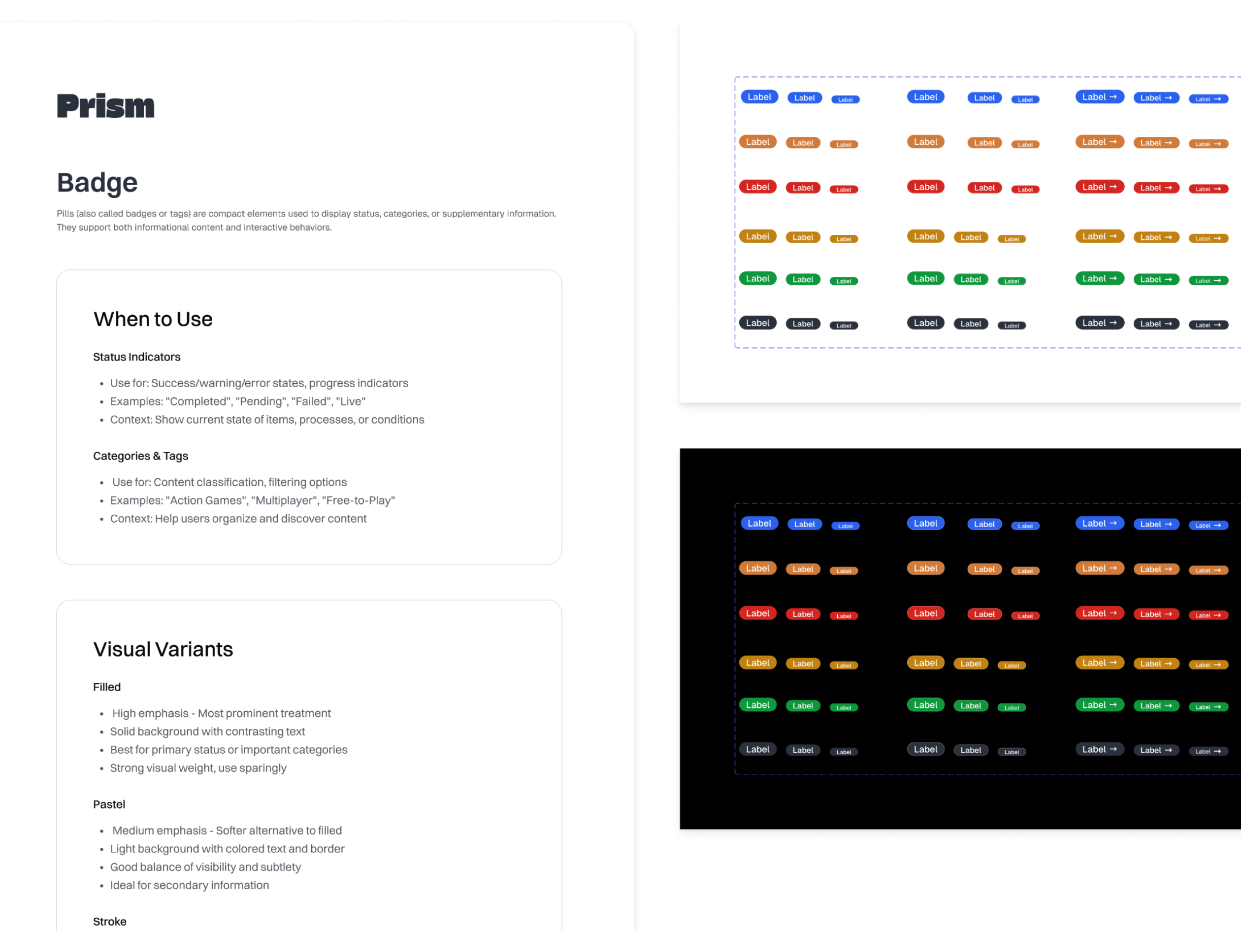
Component gallery
A key driver for Prism was to create a system that developers would love. My frontend background allowed me to design with direct implementation in mind, ensuring a smooth and efficient design-to-code pipeline.
Direct Token Translation
Every Figma Variable is designed to translate directly into CSS variables or equivalent design tokens. This ensures absolute pixel-perfect and color-perfect consistency between design and developed code, eliminating guesswork and manual reconciliation.
Component-Driven Development
Figma components were meticulously built to mirror their code counterparts. The goal is a 1:1 relationship with a component library (Storybook), making component implementation a highly predictable and accelerated process.
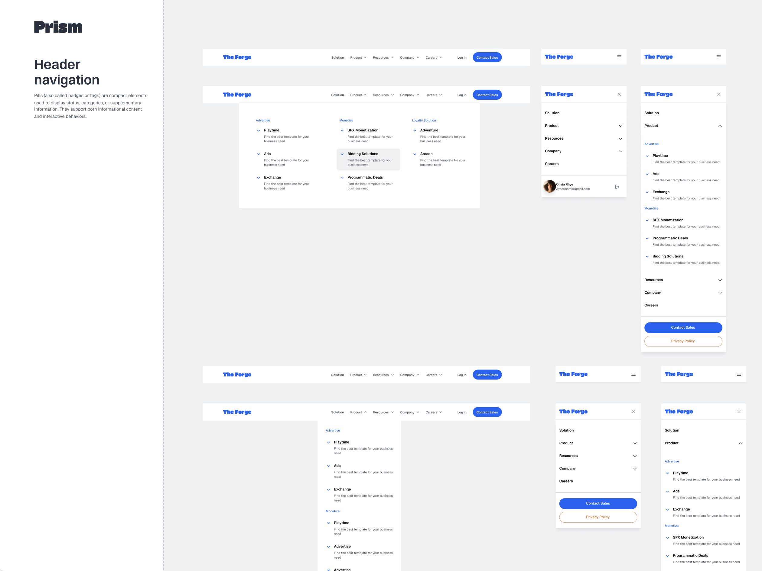
Architecture & Anatomy (The Blueprint)
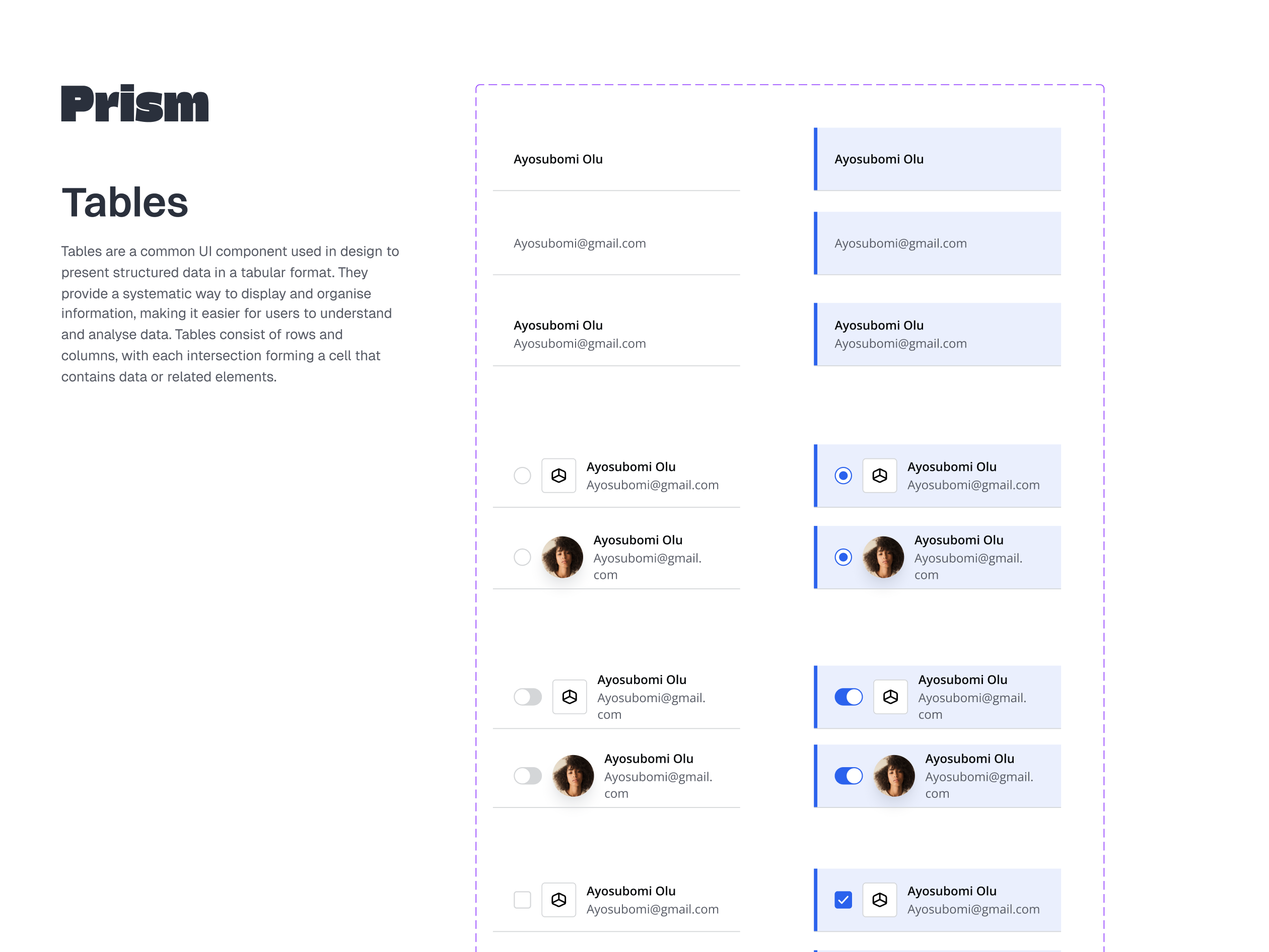
Components are built using a nested atomic structure to ensure durability. By utilizing Auto-Layout and fixed-aspect-ratio containers, I ensured all components are natively responsive. I utilized "Slot" components for complex organisms (like Modals and Navigation bars), allowing product designers to inject custom content while the system maintains control over global padding, stroke weights, and corner radii.
Component Props
To ensure the system is both flexible and high-performing, We moved away from bloated variant sets in favor of Figma Component Properties. By implementing Boolean toggles for optional elements (like hint texts and leading icons) and Instance Swaps for content-rich organisms like dashboard tables, we reduced the overall library complexity. This "props-first" architecture creates a cleaner UI for designers, significantly reducing the cognitive load required to build complex layouts while maintaining 100% system compliance.
Bridging the Gap: From Design System to Live Code
A key driver for Prism was to create a system that developers would love. My frontend background allowed me to design with direct implementation in mind, ensuring a smooth and efficient design-to-code pipeline.
Direct Token Translation
Every Figma Variable is designed to translate directly into CSS variables or equivalent design tokens. This ensures absolute pixel-perfect and color-perfect consistency between design and developed code, eliminating guesswork and manual reconciliation.
Component-Driven Development
Figma components were meticulously built to mirror their code counterparts. The goal is a 1:1 relationship with a component library (Storybook), making component implementation a highly predictable and accelerated process.
Comprehensive Documentation & Governance
- Documentation in Zeroheight for designers and developers
- Versioning strategy for the design system
- Governance model for token and component changes
- Clear contribution and adoption guidelines
Conclusion: The Impact of Prism Design System
Prism delivers a token-first, multi-brand design system that bridges Figma and code. With direct token translation, component-driven development, and comprehensive documentation, the system enables consistent, scalable product experiences across brands and themes while keeping the design-to-dev pipeline smooth and predictable.