Awtomated
Awtomated is a Translation Business Management System built for Language Service Providers (LSPs), bringing together project management, vendor coordination, finance, scheduling, and localization workflows within a single platform. As the product evolved, new operational and administrative challenges emerged. Project managers were navigating complex translation workflows, vendor assignments, scheduling, financial tracking, and reporting across disconnected experiences. My role was to design and refine core product features that reduced operational friction, improved visibility across the project lifecycle, and established scalable foundations for future growth.
- What I did
- Core product features, financial workflows, workspace organisation, service-specific project creation, resource scheduling, and vendor coordination.
- Year
- 2025
- Role
- Lead Product Designer
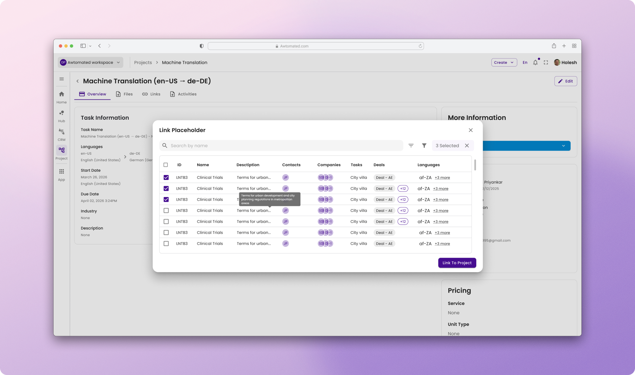
Design process
Rather than following a linear design process, I collaborated closely with product managers and engineers through an iterative workflow driven by product briefs, stakeholder feedback, and technical constraints.
- Broke down business requirements into user problems and workflow opportunities.
- Audited existing platform patterns and limitations.
- Reviewed industry tools such as Phrase, Lokalise, MemoQ, HubSpot, ClickUp, and Linear.
- Mapped user flows and edge cases before designing interfaces.
- Iterated continuously based on engineering feedback and evolving product requirements.
- Documented system behaviours, role-based permissions, and implementation considerations alongside designs.
Connecting Estimates, Invoices, and Projects in Awtomated
The problem
Awtomated serves two customer types with conflicting workflows. TBMS-only customers work entirely inside the platform: project → estimate → invoice, in order. TBMS+TMS customers do their translation work in an external TMS and only come to Awtomated for the business side. They need to create an estimate directly, often with no project in the system at all. The platform's original flow assumed the first group and forced the second through unnecessary steps.
On top of that split, the system had no clean way to pull estimate data into an invoice, no signal for whether an estimate had already been invoiced, no project budget tracking, and no way to filter or reuse line items across documents, pushing users into manual re-entry and creating real risk of double-invoicing.
The approach
I mapped both customer journeys explicitly and used that split as the test for every decision: any flow that assumed a project must exist first was wrong for half the user base. This produced a core relationship model:
Project → Estimates (invoiced or not) → Invoice (same line items),
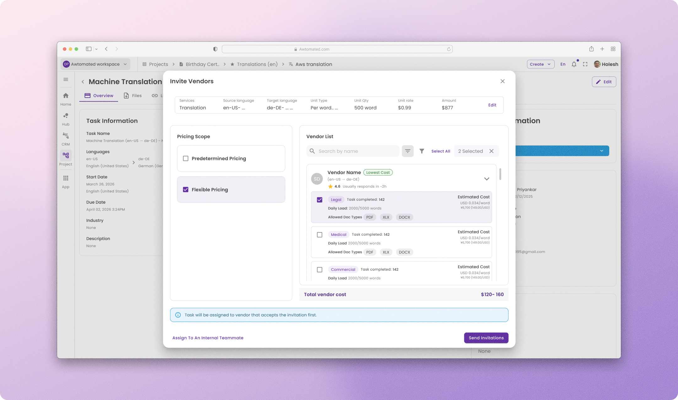
with two supporting flows: Use Case 7, which lets a TBMS+TMS user create an estimate first and optionally link or create a project afterward (never a blocking precondition); and a shared line items population modal used across both estimates and invoices, which auto-recommends the best data source (linked estimate, word count analysis, file meta, or existing line items) instead of making users build from scratch every time.
A key decision
Inside that modal, a "See all estimates" advanced view lets users search beyond the simple dropdown. My manager proposed that clicking Cancel there should still silently add the user's selections to the simple dropdown. I pushed back: a button called Cancel can't quietly commit a selection. We resolved this by renaming the pair to Discard and Add selection, and defining exactly what each affects: Discard only removes what was selected within the advanced view, while selections carried over from the simple dropdown are always preserved. It's a small relabeling, but it kept the system's language honest about what each action actually does.
Consistency fix
Unavailable states in the modal used grey chips on the card but amber warnings inside the dropdown for the same underlying meaning, which was confusing and flagged by my manager. I aligned this to the pattern HubSpot, Linear, and Notion all use: grey for "nothing here," amber only for genuinely temporary states like analysis-in-progress, red for failures.
Edge cases handled
All-options-unavailable fallback, a recommended option going stale mid-session, closing the modal without confirming, empty search results, network failure on save, and duplicate selection between the simple and advanced views. Each was resolved with a rule about where friction should live: low in the simple modal, higher (with a confirmation step) in the advanced one, where users have invested real effort.

Next
Harbor