Odem Health, Nutrition tracking that feels like a community, not data entry
A nutrition and wellness app that combines precise tracking, a supportive community and an AI coach, so healthy habits feel social instead of clinical.
- What I did
- Product strategy, competitive research, UX and UI, prototyping, design system
- Year
- 2025–2026
- Role
- Solo Product Designer
- Timeline
- October 2025 to March 2026
- Platforms
- iOS and Android, German and English
- Status
- In development
Scope
Dashboard
Protein goal
Mori chat
- 60+
- Competitor reviews analysed
- 8
- Apps studied in a UX pattern study
- 3
- Product pillars
- 2
- Languages (DE + EN)
Overview
Most nutrition apps pick one lane. MyFitnessPal and YAZIO are precise trackers. Strava is a community. None combine tracking precision, community motivation and AI guidance in one experience. Odem Health does all three: track your nutrition, stay motivated by people on the same path, and get guidance from Mori, an AI coach.
The challenge
Most nutrition apps treat users as data-entry clerks. They're accurate but joyless, and joyless doesn't retain.
Where I started
The founder had an existing German-only design. Before designing anything new, I audited it.
What I found
- No design system. Grey, orange, green and white buttons, with a different accent colour in each section.
- Onboarding started with "log in" for brand-new users. It had no progress indicator, and never introduced the community or the AI coach.
- Tracking showed 30+ nutrient rows, almost all reading "0,0 g". Missing data looked like zero, and the same breakdown appeared on two screens.
- Protein was set in two places: as a percentage in the macro split and in grams on the protein goal screen.
- The community opened on an empty feed, with no way to find or follow people, and nothing connected it to health.
- The AI coach was framed as a human nutritionist ("Ernährungsberaterin") with a user-chosen name and gender. It never referenced the user's own data.
- The profile showed age, goal and city publicly by default.
- Missing flows: lunch, dinner and snacks; portions; editing logged food; finding people; the paywall; empty states.
I then broke the brief down into objectives, target users, a core journey (Track, Reflect, Share, Connect) and a research plan.
Research
My research focused on the market and competitors.
- Competitive analysis of nutrition apps (YAZIO, MyFitnessPal, Lifesum, Lose It, Cronometer), plus indirect analysis of social and wellbeing apps (Strava, Calm, Apple Fitness, Threads and Instagram), because Odem has a social layer.
- 60+ competitor reviews from Reddit, Trustpilot and the App Store, to find where users get frustrated.
- A UX pattern study across 8 apps (Lifesum, Alma, YAZIO, MyFitnessPal, Cronometer, Strava, Peloton, Noom), mapping onboarding, food logging, dashboards, AI assistants, community feeds, posting and profiles.
What the reviews showed
- Long-time users resented gamification they couldn't switch off. One YAZIO reviewer lost a 279-day streak.
- Pop-ups after logging added friction to the most repeated action in the app.
- Users wanted simplicity and control more than more features.
Product pillars
- Community: motivation through people
- Tracking: awareness through data
- Mori AI: guidance through personalised insight
Decision 1: Health info first, community straight after
I explored a community-first onboarding. New users would land on a read-only feed and be asked to set goals when they tried to interact, or after 30 seconds. It was a strong way to stand out, but I chose the established pattern of collecting health information first, for four reasons:
- it's needed to calculate daily energy needs (TDEE) accurately
- users expect it
- completing setup is a commitment signal
- accurate data upfront means fewer errors from skipped or guessed answers
The community comes immediately after setup, before the user reaches the dashboard. Personalisation earns trust early; community converts that trust into retention.
Final onboarding: dietary style
Final onboarding: diet split
Decision 2: Mori guides, it never diagnoses
The original coach was presented as a human nutritionist. That framing implies professional dietary advice, which brings liability and trust risk that a first release shouldn't carry.
I scoped Mori tightly. Mori is a guide, a coach and an insight engine. It is not a meal logger, a replacement for tracking, or a medical advisor. Mori explains protein and nutrient gaps, surfaces why progress stalled, offers motivation when streaks slip, and suggests meal directions. It never logs or diagnoses; it always interprets.
After: Mori as guide and insight engine
Decision 3: A streak that allows a rest day
Streaks and badges aren't neutral. The longer a streak runs, the more losing it feels like punishment. Competitor reviews showed exactly that: users losing long streaks and asking to turn the feature off. The original design used the same daily flame streak, with no rules explained.
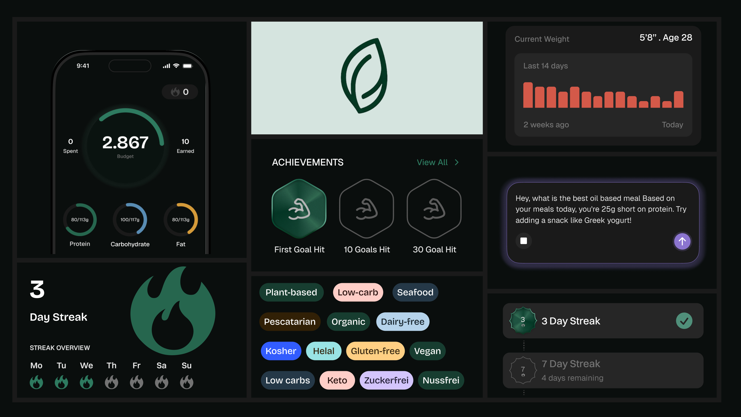
In Odem, missing one day counts as a rest day and the streak holds. It resets only after two days in a row without tracking. Daily goals turn a flat gram target into something visible and achievable. Badges reward consistency, not perfection. Gamification supports the habit; it doesn't become the goal.
Protein goal with weekly streak row
Streak celebration
Badge set
Decision 4: The community never looks empty
A new user arrives with no follows, no posts and no history. A feed that looks empty reads as a dead community, whatever the real user count is. That's what the original design showed: an empty feed and no way to find people.
The goal isn't personalisation on day one; it's a feed that feels alive. New users get suggested follows from three groups: popular members, community leaders and other new members. Personalisation comes later, once there's behaviour to learn from.
After: feed with suggested follows
Decision 5: One reason to upgrade
With the founder, I explored several premium directions. AI food tracking was first planned as a premium feature, but we moved it to a future release. We landed on a single reason to upgrade: Mori. Pro unlocks unlimited AI coaching, personalised meal suggestions, real-time feedback on dietary habits, and Mori progress insights. Pro is 11.99€ a month or 120€ a year.
Design system
The original design had no shared system. The redesign uses one: a dark-first interface; a health-focused green palette, with each accent colour carrying a meaning; consistent spacing and components; and an accessible type hierarchy.
Micro-interactions (goal completion, progress rings, the goal slider, streak celebrations) make progress feel tangible, not just visible.
Where it stands
Odem Health is in development, built with a frontend and a backend engineer. There are no usage numbers yet. After launch, the measures that matter are:
- the share of users who log on at least 5 of their first 7 days
- whether new users follow someone in their first session
- conversion to Pro
Reflection
The most impactful decisions on Odem Health weren't visual. Defining Mori's boundaries, simplifying the paywall, sequencing community after onboarding, and giving streaks a rest day all came before any screen. None of that shows up as a screen. It shows up as why the screens work.
Components
Ten pieces from the system, each with one interaction.